The Overview screen
Your entry dashboard: the four KPIs, visibility over time against competitors, top brands and the sources engines cite.
What this screen is for
Overview is the screen the dashboard opens on, and the one named Overview in the sidebar. It answers four questions in a single pass: do the engines name you, how high in the answer, how much of the brand talk is yours, and in what tone.
Almost everything here is counted on answers rather than on questions. One answer is one prompt sent to one engine. The Nike demo tracks 10 prompts on 6 engines, so a run produces 60 answers, and 43 of them name Nike. That 60 is the denominator behind most of the screen.

The header gives the date of your last run. The numbers below it are not read from that run alone. For each pair of prompt and engine, the screen keeps the latest analyzed answer inside the period, so a pair that failed last night still counts, with the answer it gave before.
What you see
Two controls sit above the panels. Run now queues a run outside the schedule, and the period selector scopes everything under it. All time is the default and it is not all of your history: it means the last 8 runs that hold an analyzed answer. Pick a range instead and the KPIs, both charts and both lists rescope to the runs inside it, up to 60 of them. A range wider than 366 days is trimmed back to the last 366.
| KPI | What the number is | Worth knowing |
|---|---|---|
| Visibility score | Answers naming you, over every analyzed answer of the period. On the demo, 43 out of 60, so 72%. | The label beside it reads 10 prompts. That is how many prompts are active today, not the denominator, and answers to a prompt you have since paused still count in the score. |
| Average position | Your rank averaged over the answers that name you and place you in a ranking. | An answer that names you in prose without ranking anything is a third state, neither absent nor ranked, and it stays out of this average. Ranks are clamped to the 1 to 50 range when the answer is analyzed. |
| Share of voice | Your mentions over every brand mention counted on those same answers. On the demo, 43 out of the 245 mentions split across 8 brands, so 17.6%. | A brand counts once per answer at most. There is no ceiling and no filter: brands you never declared are in the denominator, because they are in the conversation. The count on the right is the whole ranking, including declared competitors that were never named. |
| Positive sentiment | Positive mentions over the mentions the analysis could read a tone on. | The 43 mentions printed beside it are the answers naming you. The denominator is that number minus the mentions with no readable tone, so it is the smaller of the two. |
The little arrow under each number is a comparison, not a trend. The screen builds a second, older snapshot by taking the previous analyzed answer of every prompt and engine pair inside the same window, runs the same four calculations on it, and prints the difference. A pair with nothing earlier is missing from the older snapshot while it still counts in the current one, so the two sides are not always built on the same number of answers. Average position has its arrow flipped, since a smaller rank is better and green has to mean progress on all four cards. No arrow at all means one of two things: nothing to compare with yet, or a difference of exactly zero.
Visibility over time
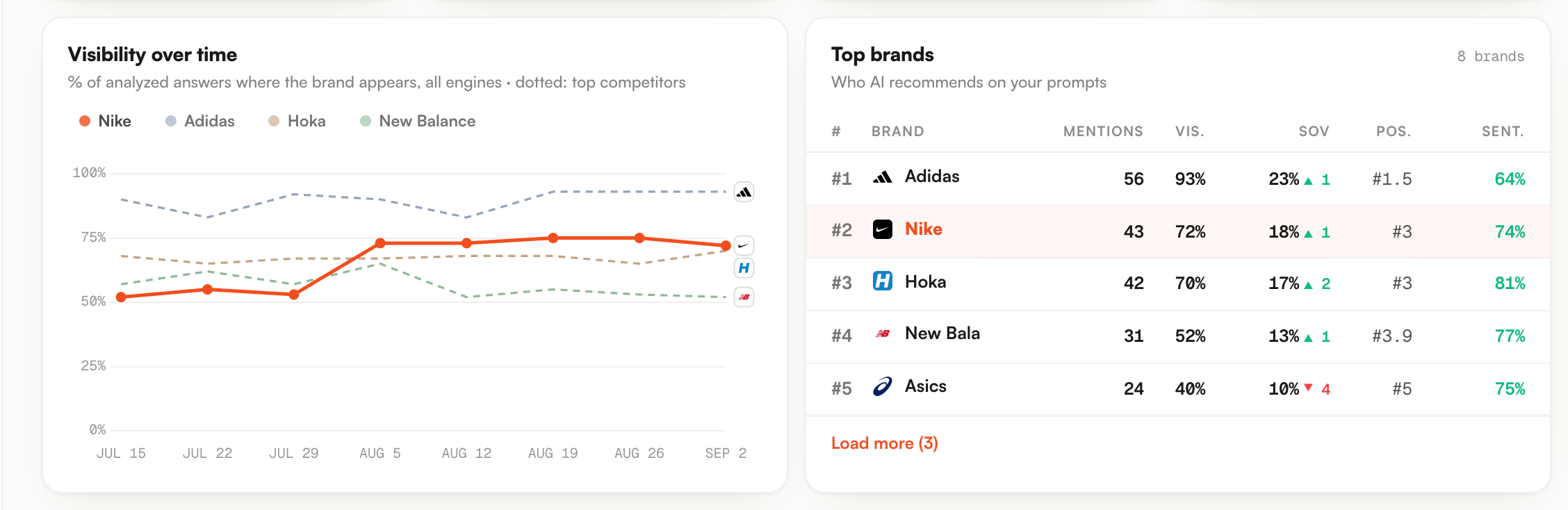
One point per run, labelled with the run date, eight points by default. Your line is the share of answers in that run that name you, all engines together. There is no line per engine here, deliberately: one definition for everybody is what makes your line and the competitor lines comparable.
The dotted lines are up to three competitors, taken from the top of the current share of voice ranking, you excluded. On the demo that gives Adidas, Hoka and New Balance. Click a name in the legend to hide its line and click again to bring it back.
One subtlety: each point is recomputed over every analyzed answer of that run, while the KPI above reads the latest answer per pair. The last point and the visibility score agree as long as the last run answered every pair, and drift apart when it did not.
Top brands
This is the ranking your share of voice is built on, brand by brand. Five rows, your own highlighted and pulled in even when it ranks lower than fifth, then Load more for up to fifteen more inside the same card height. The count in the corner is the size of the whole ranking, which can run past what the table prints.
| Column | What it counts |
|---|---|
| Mentions | Answers naming that brand, one per answer at most. A brand named four times inside one answer counts once. |
| Vis. | Share of the analyzed answers naming it, the same definition as your visibility score. |
| SOV | Share of all brand mentions, with its own arrow against the older snapshot. |
| Pos. | Average rank over the answers that actually rank the brand, first occurrence in each. A dash when none of them do. |
| Sent. | Positive share of the mentions with a readable tone. Green from 60%, red under 40%. |
Clicking a row opens that brand on the Competitors screen, where the answers and the wording behind these numbers are.
Cited sources over time
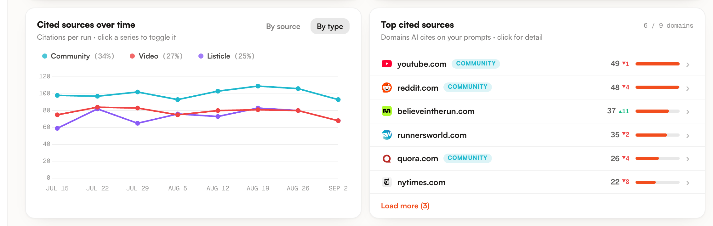
Citations per run, on the same runs and the same dates as the chart above. The axis counts citations, so it is not a percentage and it has no ceiling.
A citation here is one cited page inside one answer. The same page quoted by two answers counts twice, and two pages of one domain quoted by the same answer also count twice.
By source, the default, plots the five most cited domains of the period. By type plots up to five kinds of page. The kind comes from a heuristic on the domain and the path, a page can carry several labels, and the chart keeps only the first one in a fixed order: video, community, reviews, wiki, listicle, guide, blog, homepage. Citations that match no label are left out of the By type lines, but they stay in By source, where only the domain matters.
The percentage in each legend entry is that series share of all citations in the period, untyped ones included, which is why the type shares never add up to 100. On the demo they read Community 34%, Video 27%, Listicle 25%.
Top cited sources
The domains cited by the answers of your current state, ranked. This panel counts one hit per answer: a domain quoted three times inside the same answer counts once, which is why its numbers sit lower than the lines on its left.
Six rows, then Load more up to twenty. On the demo the counter reads 6 / 9 domains, and that second number is every distinct domain cited, including the ones past the twenty the table stops at.
The bar is drawn against the most cited domain of the list, not against a share of citations. The arrow beside the count compares with the older snapshot. A You badge marks your own domain or one of its subdomains. A Community badge marks a domain from the registry, Reddit, YouTube, Quora, Wikipedia, Stack Exchange, Yelp and fourteen others.
Click a domain and its detail opens: citations, pages cited, how many of your prompts it touched, and your average rank on the answers that cite it. That last figure is the one to read first, because it turns a source into a verdict. Below it, the cited pages are grouped by topic, each with the engines that quoted them.
Below these four panels the screen continues with a preview of your eight most visible prompts, the ranking by topic, and two summary cards for AI Traffic and AI logs. They do not all obey the period selector: the prompt preview defaults to the last 30 days rather than the last 8 runs, the ranking by topic always reads the last 8 runs and your active prompts only, and the two summary cards always cover the last 14 days. Each has its own screen, and its own page here.
What you can do
All time means the last 8 runs. A range narrows the KPIs, both charts and both lists at once, which is how you make a monthly report and the screen it came from agree.
Position alone misleads. Falling out of the answers where you ranked fifth improves your average position and lowers your visibility at the same time, and only the pair of numbers says which of the two happened.
Click the legend to hide the brands you are not comparing right now. The chart becomes readable at two lines, and the shape of the gap matters more than either curve on its own.
By source names the domains to go and work on. By type says what kind of page the engines lean on in your market, which is the more useful of the two when you are deciding what to produce next.
A brand row goes to Competitors. A domain row opens its detail, with your average rank on the answers that cite it, which is the shortest path to why them and not you.
A run is one call per prompt and per engine, so manual runs are capped: ten minutes between two manual runs of the same brand, twenty manual runs a day for the whole workspace. The weekly run is automatic and never touches those limits.
Limits worth knowing
| What it looks like | What is actually happening |
|---|---|
| A percentage of your prompts | Nothing on this screen is measured on prompts. The denominators are answers and mentions, and one prompt yields one answer per engine. |
| Two source panels that should agree | They count differently on purpose. The chart counts each cited page in each answer, run by run. The list counts one hit per answer per domain, on the current state only. On the demo, youtube.com reads 49 in the list and between 68 and 84 per run on the chart. |
| A line that never breaks | A run with no measurement for a series is bridged rather than shown as a hole. A long straight segment can be hiding a run that produced nothing for that line. |
| Type shares that never total 100 | Only five types are plotted, and citations matching no type stay in the denominator of the legend percentages. |
| A dash | No measurement, not a zero. A dash under Pos. means the brand was named without being ranked anywhere. |
| A complete ranking | Everything is capped. Eight runs by default and sixty on a custom range, three competitor lines, five brands plus fifteen behind Load more, twenty domains in the list and twelve pages per domain in its detail. One answer records at most fifty cited URLs and fifty brand names. |
| An empty screen after picking a range | A window holding no run does not show zeros, it falls back to the empty state, which reads as though the brand had never run. Widen the range and the panels come back. |
Where to go next
Overview gives you the state. The screens behind it give you the cause, and each takes a different question.
- Prompts : which questions you are absent from, engine by engine.
- Competitors : who gets recommended instead of you, and the sentences the engines use to justify it.
- Sources : the domains behind the citations, and how many of their prompts never name you.
- Topics : the same ranking grouped by buying theme.
If the score is lower than it should be, the guide on finding where you lose visibility walks those screens in the order that rules out one cause at a time.