Read your scorecard
Four numbers sit at the top of your Overview. Each one is a fraction, and knowing its denominator is the difference between reading your data and guessing at it.
One example, carried through
Rather than define each metric in the abstract, take one week on our Nike demo workspace and follow it through all four.
Those four sentences are the four numbers. Everything below is what each one does with them.
Visibility score
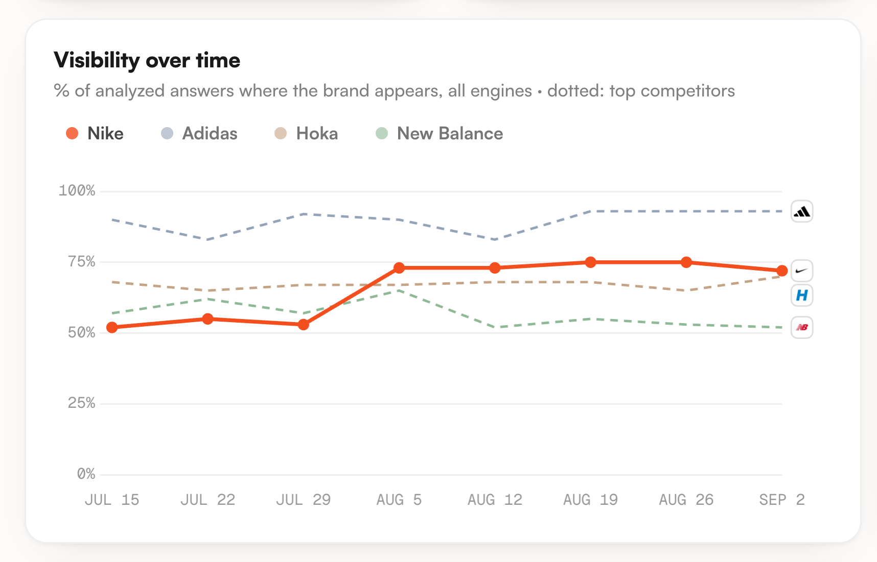
The share of analysed answers where your brand is named. In the example, 43 out of 60 answers, so 72%.
The denominator is answers, not questions. This trips people up, because the label beside the score counts your prompts: it reads 10 prompts while the score is measured on 60 answers. One engine that never names you drags the whole score down while the others look fine, which is exactly the kind of thing you want the number to expose.
It is the number to watch first, because it is the only one that answers the question your client actually asks: do we come up at all?
Average position
Where you land in an answer, averaged over the answers that name you and place you somewhere. Two kinds of answer are left out. Ones that never name you, and ones that mention you in prose without ranking anything. Neither counts as a bad position, because neither is a position at all.
Lower is better here, so the arrow is flipped to keep the convention of the rest of the dashboard: green means progress, which for this metric means the number went down.
Share of voice
Of every brand mention on your prompts, how many are yours. In the example, Nike takes 17.6% of the mentions shared between 8 brands.
The denominator is every brand the engines named, not only the competitors you declared. A rival you have never heard of dilutes your share the moment an engine starts recommending it, which is the early warning this metric exists to give you.
It compares your current state with your previous one. It is not a running total, and it is not a market share. A crowded answer that names eight brands gives everyone a small share, and that is information about the answer, not a failure on your part.
Positive sentiment
Of the mentions where the answer says enough to judge, how many are positive.
That qualifier matters. A one line mention that just lists you among five names carries no opinion, so it is not counted in this percentage. The mention count shown beside the metric is the total number of mentions, which can be larger than the number the percentage is actually computed on.
It is the slowest of the four to move and the least useful week to week. Read it once a month, or when it drops sharply, which usually points at one bad source being quoted rather than a real reputation shift.

What the combinations mean
The four numbers are only worth reading together. Three patterns come up again and again.
| You see | It usually means | Do this |
|---|---|---|
| Visibility up, position down | You are being named on more questions, but late in the answer. You entered the conversation without becoming a first recommendation. | Good news. Work on the prompts where you are cited lower rather than chasing new ones. |
| Visibility down, position up | You lost your weak placements. The average looks better because the bad ones left. | Open the prompts that stopped naming you. This is a loss, not a gain. |
| Everything flat, share of voice down | You did not move. Someone else arrived and is taking mentions on your questions. | Go to Competitors and find who gained. This is the pattern that predicts the next quarter. |
When a number looks wrong
Before assuming a bug, check the denominator. Most surprises are one of these.
| Symptom | Likely cause |
|---|---|
| Visibility dropped without any prompt changing | You enabled an engine. New answers joined the denominator, and a new engine rarely starts by naming you. |
| No average position at all | You were named, but never in a ranked list, or never named at all. There is nothing to average. |
| Share of voice fell while mentions rose | The answers got more crowded. Your count went up, everyone else went up more. |
| Sentiment jumped ten points on a quiet week | A small denominator. On a handful of judgeable mentions, one answer moves the percentage a lot. |
If it is none of those, every number traces back to an answer. Open the prompt, read what the engine actually wrote, and the explanation is usually in the first two lines.