The Reports screen
What your client receives: branding, sections, recipients and the automatic send after each weekly run.
What this screen is for
This screen turns a finished tracking run into a document you can hand over. A PDF for the client, a CSV annex for whoever wants the raw rows, both built from the same snapshot.
Each brand carries one report configuration. You set it once: what goes in the document, who receives it, whose name is on the cover. After that the weekly run does the work.
Only the scheduled weekly run triggers a report. A run you start yourself from the dashboard completes, updates your data, and sends nothing to anyone. Nobody receives a report because you clicked refresh.
Recipients do not need an account. The files travel as attachments, so a client who never logs in still gets the whole thing.
What you see
Three panels. Settings on the left, a preview of the real document on the right, and the history of everything generated so far underneath.
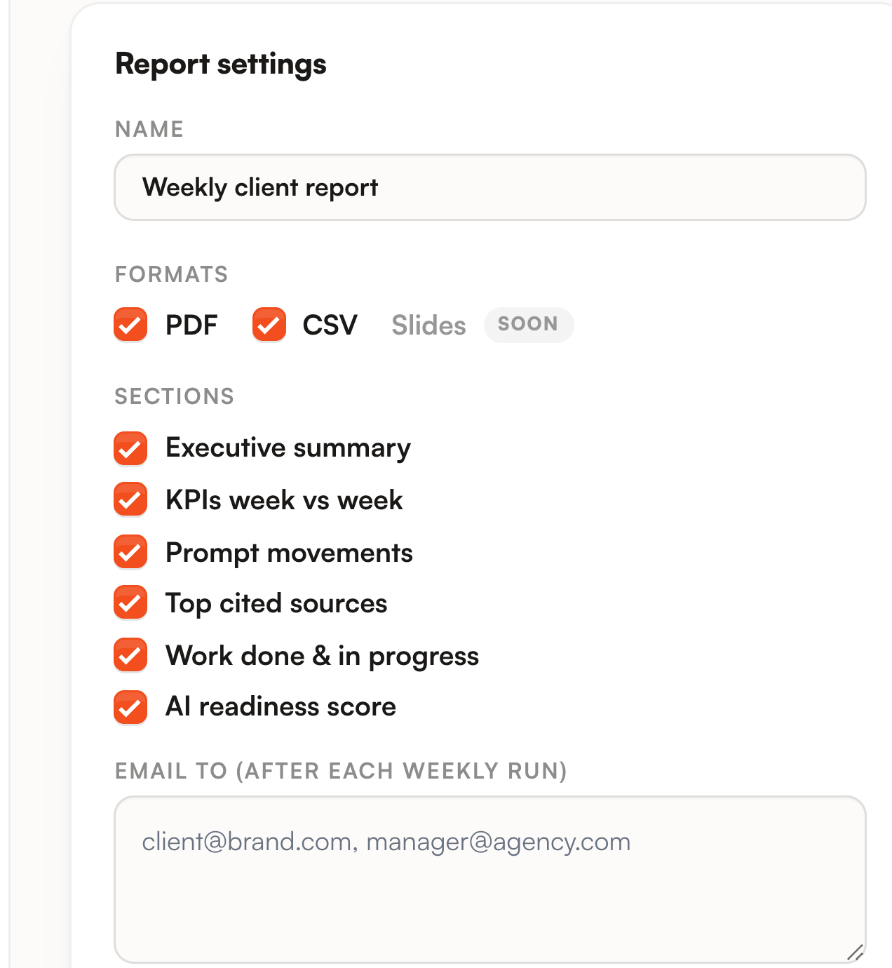
Formats are PDF and CSV, and at least one has to stay ticked. Slides is labelled soon and cannot be selected.
The six section checkboxes decide what the PDF carries.
| Section | What it puts in the document |
|---|---|
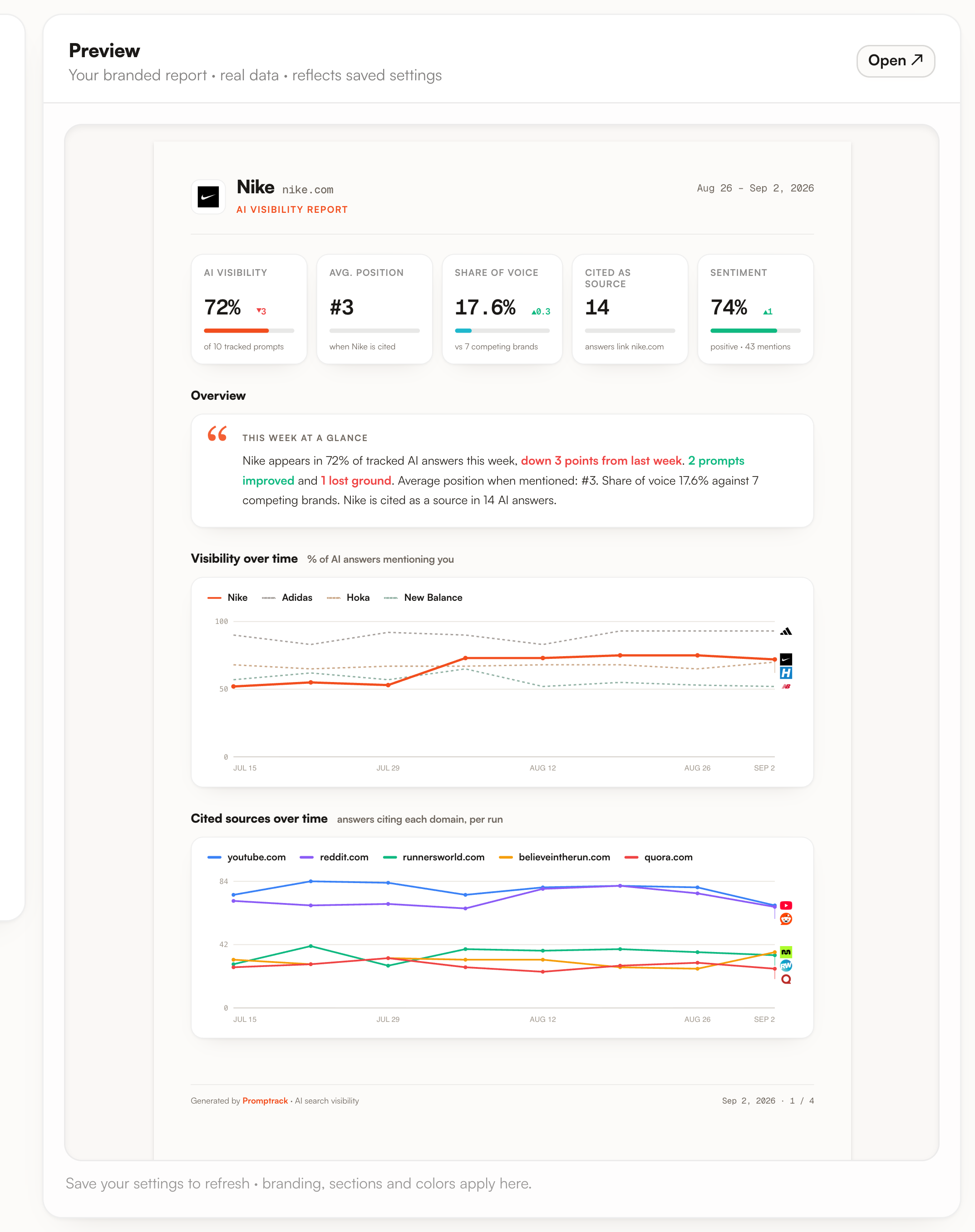
| Executive summary | The Overview paragraph on page one. It is assembled from the numbers by a fixed template, so it says visibility and its move against last week, how many prompts improved and lost ground, average position, share of voice and how many answers cite your domain. |
| KPIs week vs week | The five tiles at the top: AI visibility, average position, share of voice, cited as source, sentiment. The Visibility over time chart is tied to this box too and disappears with it. |
| Prompt movements | One row per prompt, the rank each engine gave you, and a delta comparing your best rank this week with the best of the last ranks recorded on that prompt, engine by engine. |
| Top cited sources | Up to eight domains the engines quoted, with the number of answers quoting each and its change. |
| Work done & in progress | The action plan table: up to six actions done in the last seven days or currently in progress, followed by the four highest impact ones still to do. |
| AI readiness score | The score out of 100 from the last finished site audit, its three subscores, and up to three open findings. |
Below them, the recipients field takes several addresses separated by commas, spaces or semicolons. Then come the branding fields: agency name, accent color, and the cover logo, uploaded as PNG, JPG or WebP under 512 KB. The agency name prints under Prepared by at the top of page one, and the accent color runs through the document, from the report title to the KPI bars. The logo you upload is kept with the configuration and shown back to you in this panel, and the printed document carries your name and your color rather than your logo.
The right panel renders the same HTML the PDF is made of, on your real data, so it is the document itself and not an illustration of it. Open sends it to a new tab at full size.
The history table at the bottom lists the last thirty reports, newest first.
| Column | What it holds |
|---|---|
| Period | The seven days ending on the day the run started. That window is stamped when the report is created and never recomputed. |
| Status | Pending and Generating in blue, Generated in green, Failed in red. A failed row with no file left behind shows the word failed on the right, and hovering it gives the reason the job recorded. |
| Coverage | The share of active prompt and engine pairs the run actually analysed. It is written when the report is built, so a row that has not been generated yet shows a dash. |
| Sent | When the email left, in the same timezone as the rest of the dashboard. A dash means nothing was emailed for that report, usually because no recipient was configured at the time. |
| Download | One button per file stored on that report, so PDF alone or PDF and CSV depending on the formats ticked when it was generated. |
What you can do
Save settings applies to the next generation and to the preview. Untick a section and the whole block leaves the document, including its heading.
One bad address blocks the save and the error names it, up to three at a time. Nothing is silently dropped, because a recipient quietly ignored is a client who never gets the report. Duplicates are removed.
Name and color go out with Save settings. The logo has its own Upload button and is saved on its own: it is re-encoded to PNG on arrival and stored on a private disk, never served as a raw file. Remove deletes it.
Generate automatically after each weekly run is what puts this configuration in the queue when the Monday run finishes. Off, the screen still works and nothing is produced on its own.
The button builds the report for the last completed run, whatever started that run, and it is greyed out until you have one. If a report already exists for that run it is rebuilt with your current settings, which is how a branding change reaches the current week.
Limits worth knowing
The cover is yours. The document is not entirely.

The document is not built from one single run either. Visibility, average position, sentiment, the prompt movements and the answer excerpts come from the run the report is attached to. Top brands, share of voice, cited sources, both charts and How AI describes you are read from the current analytics state, which takes the last result of each prompt and engine pair over the last eight runs. AI readiness comes from your last finished audit, and the audit has its own weekly schedule, a day after the tracking run.
The six checkboxes do not cover everything printed. Top brands, What AI actually says and How AI describes you appear whenever there is data for them, and so does the Cited sources over time chart. There is no switch for those four blocks. How AI describes you is the one that comes and goes on its own: it is left out when your brand is not cited enough for recurring themes to mean anything.
The PDF is curated and the CSV is not. A prompt with no rank on any engine is dropped from the movements table, sources stop at eight rows, actions at ten, excerpts at three, the brand leaderboard at six. The CSV keeps one line per prompt and per engine, including everything the PDF left out, with the rank, the mention, the sentiment and the delta.
Coverage tells you how much of the week was actually measured. Below 100% the run did not analyse every active prompt on every engine, so read that report as a partial week rather than a flat drop.
There is no public share link. Downloads live behind the login of your workspace, so the only way a client reads the report without an account is the email attachment.
History is frozen on purpose. Generate now only ever rebuilds the report of the last completed run, so past weeks keep the data and the settings they were generated with. One configuration per brand, so two clients tracked in the same workspace get two brands, not two reports on one.
Where to go next
- Actions and reports : the weekly rhythm that makes the numbers in the report attributable to the work you did.
- Action plan : where the Work done and in progress section gets its rows, and how their impact is ranked.
- Site audit : the score behind the AI readiness block, and what its three categories check.